Revamped Icons for Google Messages, Phone, and Contacts: A Fresh Look for Your Apps
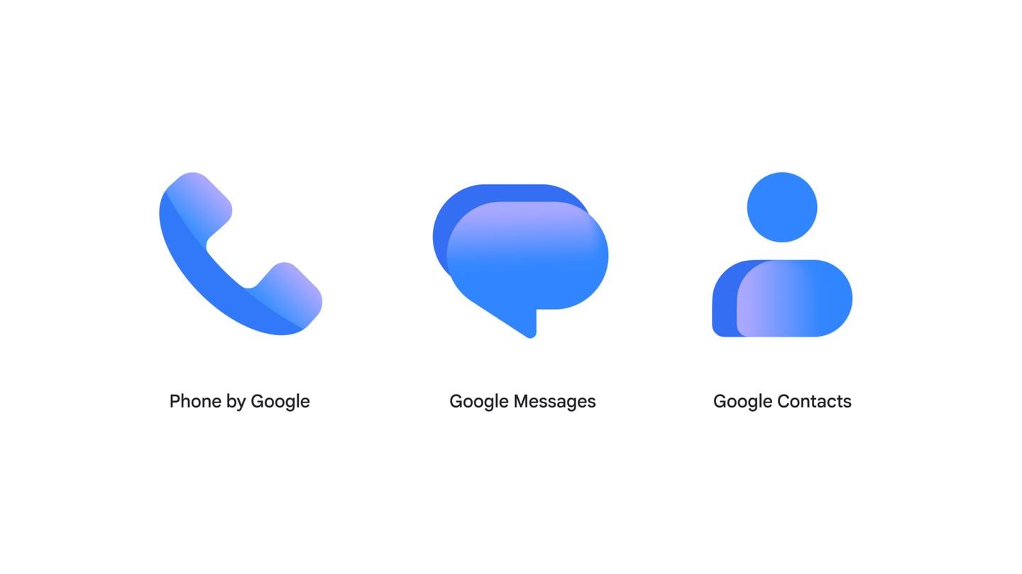
Google is enhancing the visual appeal of its essential communication applications with new icons for Google Messages, Phone by Google, and Google Contacts. This update, which is rolling out starting today, aims to provide users with a more cohesive and modern look while maintaining the functionality that users rely on daily.
New Icon Design Features
The redesigned icons come with several notable enhancements. Users can expect sharper and clearer visuals that improve the overall aesthetic on their home screens. One of the most significant changes is the introduction of a subtle gradient that adds depth and vibrancy to the icons. Additionally, the edges of the icons have been made more readable, making it easier for users to identify their favorite apps at a glance.
Alignment with Google’s Design Language
The updated icons have been crafted to align more closely with the broader Google design language. This means that they feature updated curvature and coloring that mirrors other popular Google applications, including the core Google logo. As a result, users will enjoy a more unified appearance across their app interfaces, enhancing the overall user experience.
Functionality Remains Intact
Despite the visual upgrades, there is no change to the core functionality of these apps. Users can continue to rely on Google Messages, Phone, and Contacts for their communication needs without any interruptions or alterations in service. The focus of this update is purely aesthetic, aimed at refreshing the look and feel of these essential tools.
Community Engagement
Google values user feedback, and this update is a direct result of community input. Users are encouraged to check out the conversation on the Google community forum to share their thoughts and experiences regarding the new icons. This engagement helps Google continue to refine and improve its applications based on user preferences.
What to Expect Going Forward
As the rollout progresses over the coming weeks, users will notice the new icons appearing on their devices. This change is part of Google’s ongoing commitment to enhance user experience through thoughtful design improvements. With a focus on clarity and modernity, these updates are set to make daily interactions with these apps more enjoyable.
Stay tuned for more updates from Google as they continue to innovate and improve their suite of applications.
Source for the original facts: Original source.